Frame
<ns-frame> 
Overview
Frame provides page navigation layout specific to a particular context eg.. User account.
✨ This is an auto-generated AI summary of the ns-frame's documentation.
It may not be accurate. ✨
The ns-frame component comprises a header and buttons that are adjacent to an anonymous content area. When a button is clicked, it navigates through the content. This component should not be used in conjunction with the ns-header. It is particularly useful in scenarios such as when a user is logged into their account.
Examples
Guidance
All examples
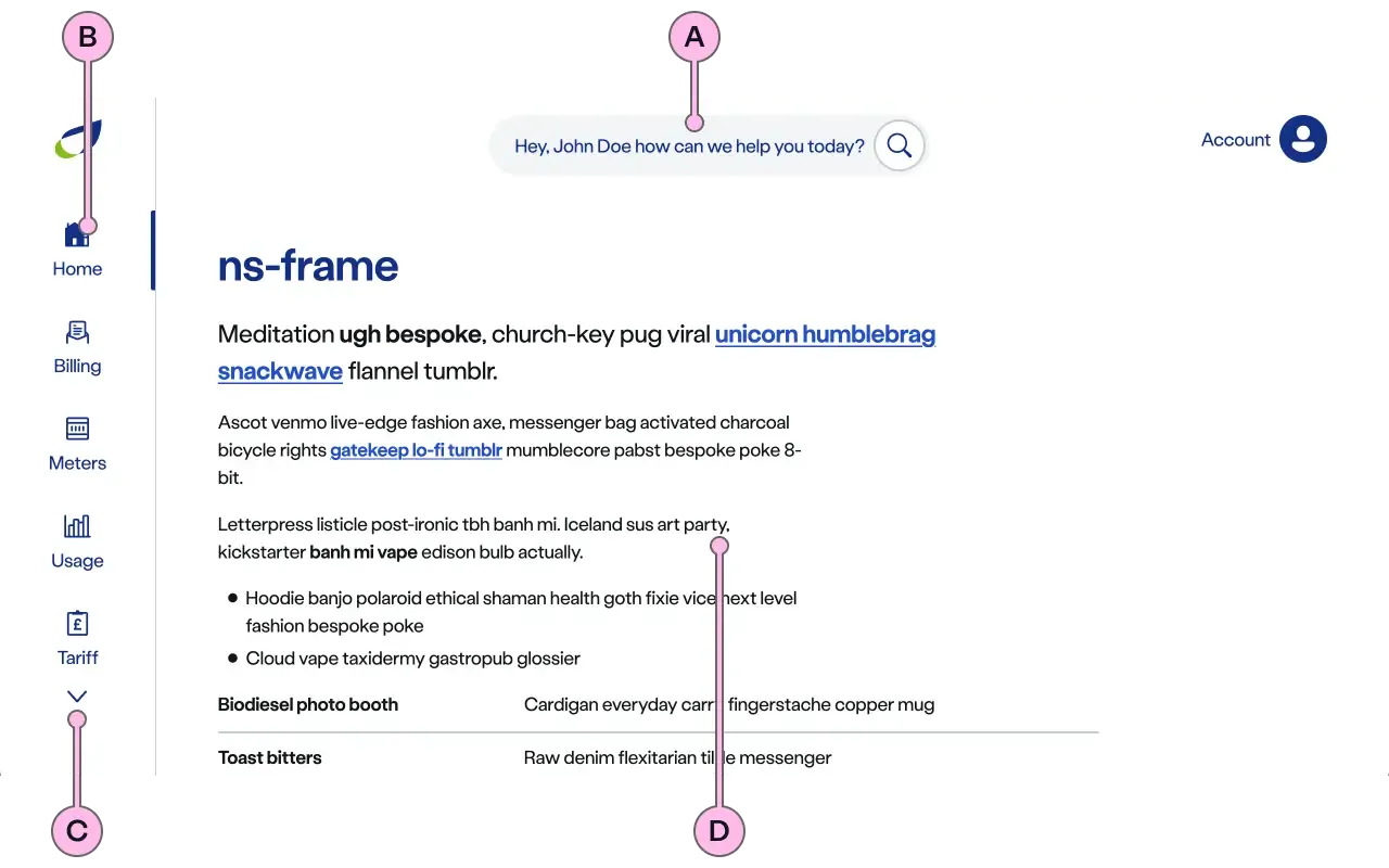
Key
| Key | Field type | Guidelines |
|---|---|---|
| A | Header | Frames the top of the page with a logo and an interactive icon. This icon, along with its label, does not serve general navigation purposes. Instead, it activates a drop-down menu that presents items such as account information. There are also various Search options to choose from - refer to the examples provided above. |
| B | Buttons | Each button includes an icon and a label and has states for active, hover, and selected. All buttons are contained within the menu, which becomes scrollable when the number of buttons exceeds the visible space. There is also the flexibility to hide all items, display as few as two, or show many items in the menu. |
| C | Menu scroll chevrons | These are interactive elements that provide visual cues and a method to navigate through the menu of buttons. This allows buttons positioned outside the visible area to be scrolled into view. These chevrons will automatically disappear if the number of buttons fits within the visible area. |
| D | Anonymous slot | Include headings, lists and paragraphs. Divide content into short paragraphs as it is easier to consume, and aids effective page scanning. Include emphasis with <strong>, inline links <a>, lists <ul> <ol>. Add a caveat link if required. This should be followed by the nsx-footer to indicate the end of the page. |
Implementation
Placement
The ns-frame component can only be used as a child of the <main> element.
Specification
Attributes
active-button
- Property
activeButton- Description
- The optional button index that needs to be selected by default.
- Type
number- Default
undefined
name
- Property
name- Description
- The account holder name that needs to be displayed.
- Type
string- Default
undefined
show-search
- Property
showSearch- Description
- The toggle to show search option in the header.
- Type
boolean- Default
false
hide-buttons
- Property
hideButtons- Description
- The toggle to hide the navigational buttons.
- Type
boolean- Default
false
hide-menu
- Property
hideMenu- Description
- The toggle to hide the menu in the header.
- Type
boolean- Default
false
ignore-prefix-path
- Property
ignorePrefixPath- Description
- The path pattern to be ignored from the window location to match the button navigation link.
- Type
string- Default
buttons
- Property
buttons- Description
- The list of button objects. Each button has navigation link.
- Type
Array- Default
[]
menu
- Property
menu- Description
- The list of menu items that needs to be displayed in the navigation header.
- Type
Array- Default
[]
type
- Property
type- Type
string- Default
standard
Slots
| Slot | Permitted tags | Description |
|---|---|---|
| Anonymous slot | The anonymous slot for the content that needs to be displayed. |
Events
| Name | Description |
|---|---|
search-click | Dispatched when the search option is clicked. |
menu-click | Dispatched when the menu item is clicked. It holds the menu details. |
logout-click | Dispatched when the logout CTA is clicked from the account menu. |
button-click | Dispatched when the navigational button is clicked. It holds the button details. |
Last updated: